Saturday, 25 October 2014

The Thursday Blog [Bonus Post]: Thoughts on the Rule of Thirds in relation to binary vision


I was wondering as to why the rule of three might be so effective and I wondered if it might be based upon our binary vision. Having two eyes splits our field of view (at least horizontally) into three sectors that match up with the rule of three; left, right and between the eyes. I haven't found anything to back this up so it is purely speculation on my part but it got me wondering how variant ocular physiologies might influence the rule of three, with a third eye, depending on its positioning perhaps the viewer would be more inclined to a Rule of Five, perhaps eight eyes like a spider would use a rule of ten? or would it be simplified?

Also the positioning of our eyes are the result of our evolution as predators, herbivores tend to have wider set eyes giving them a wider field of vision to better detect predators but would this alter the rule of three? I assume the proportions would be different based on the extended field of view.

The Thursday Blog: Fibonacci and The Golden Ratio

In mathematics the Fibonacci sequence is a seequence of the following integers:

1,1,2,3,5,8,13,21,34,55,89,144...

It can be represented visually this way:

This is the basis for the Golden Ratio, that can be used as a compositional guide to help balance compositions of images in an aesthetically pleasing manner:


It has been used for centuries by the likes of Da Vinci.


Below is a video by Ali Shirazi examining a contemporary use of the Golden Ratio in the film There Will be Blood.


Here are a selection of posters from baubauhaus that also make use of the golden ratio

A couple of many many MANY examples in architecture

Frank Millar's Dark Knight Returns
One I personally found in Watchmen, I also found occurrences in issues of Sandman and Promethea


Rather more oddly the the Fibonacci sequence occurs regularly in nature:

Romanesque Brocolli (The most delicious Fibonacci Sequence?) 

Hurricanes

Spiral Galaxies

DNA


The psychologist Gustav Fechner  devised a test to see what role the golden ratio plays in human perception of beauty. While his results showed a preference for rectangle ratios centred on the golden ratio more recent attempts to test his hypothesis have been inconclusive at best.

The Golden Ratio is clearly an affective tool but its also a great mystery that seems intricately bound with the basic structure of the universe. And that just makes it cool.


Wednesday, 22 October 2014

Accessibility and Alphabets

At a talk posted on the Creative Bloq Derek Featherstone highlights how utilizing Accessibility in design can improve user experience across all users.


This got me to thinking about accessibility of typography and written communication in general. My first stop was Braille.


I found Greg Bland's Kobigraph designs beautiful in their execution. And may be one route I go down, there's plenty of information to design a new font based on the alphabet.

Looking into an abstract alphabet like Kobigraph made me think of other alphabets. The first that came to mind was morse code, another "language" that could be represented though audio and and tactile mediums. I decided to try the latter to trial it's effectiveness.

Making use of my girlfriend's pattern notcher I use it to cut a pattern along the border of pieces of card.

Notched Morse Code - The Alphabet

Notched Morse Code - The Alphabet (Close Up)

Notched Morse Code - Fine Tooth Comb

Notched Morse Code - Fine Tooth Comb
I really like the effect, despite a couple of "spelling" mistakes with the "Fine Tooth Comb", it seems like a successful experiment. I really like the tactile effect but I also feel it would be effective in a purely illustrative piece to add coherent and subliminal pattern to the piece.

International Sign Language also holds possibilities, both through still image or animation/film.


One divergent idea I thought of sprung out of one of my favourite quotes 

"Whoever saves one life saves the world entire"

Surely this is a form of idiom too? If only one far more densely layered than most that spontaneously emerge. Unfortunately I was unable to source a translator for what I would have like to have done as a design which would have involved highlighting the translation from the original hebrew text in the Talmund, This text heavy idea would later influence my final choices.


Colourful Idioms: The Final Four


This first peace is probably my favorite, once again I find myself drawing on the esoteric, this time using the alchemical symbol for the Philosopher's Stone, the legendary "Great Work" of the alchemists mistakenly said to be able to turn lead into gold. Many scholars now believe the great work was a spiritual process of achieving some level of personal enlightenment; a noble goal and perhaps more valued to some than gold.  The deciding factor was the origin of the phrase being Shakespeare's Merchant of Venice. Shakespeare himself is said to have encoded many alchemical secrets into his works. Make of that what you will but I thought it was a great play on words that would allow me to take the phrase in a relevant yet none literal direction. I decided to leave the grid visible to help guide the eye down the text.
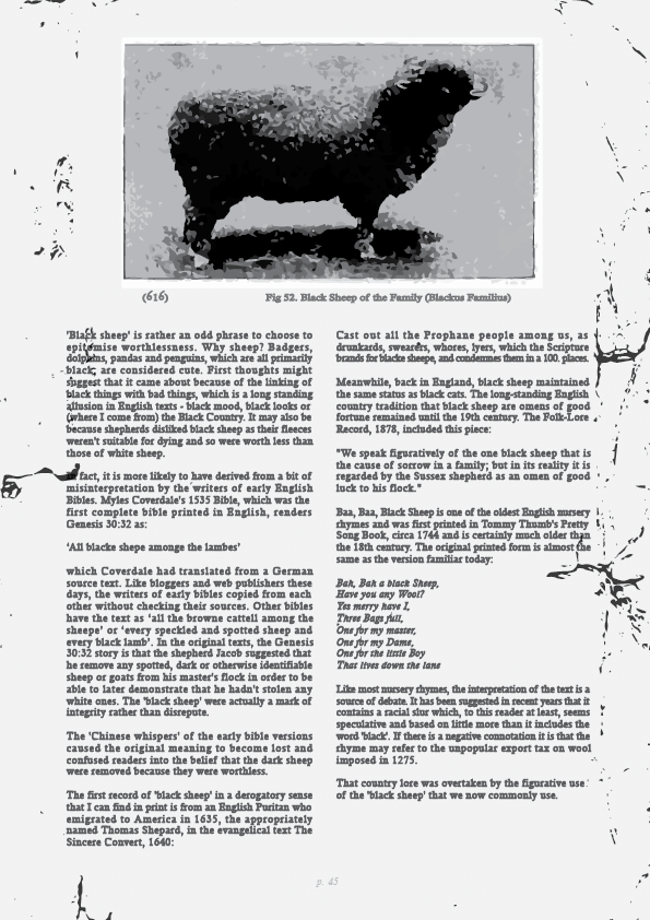

The black sheep of the Family is an oldie and a goody and for it I drew on my own family of experience, specifically my grandfathers old outdoors manuals from training his dogs and shooting as well as cartoon artwork they had a few signed pieces of around their house ever since I was little; the artist's name escapes me now but he was at least semi-local. I love old books and reading up on typography reminded me of how much I can appreciate the aesthetic of a good book.

[Grid reference; saved to different drive, will upload asap]


Blood in the Water was my first design and was much more a practical piece compared to the prior two as I had to reacquaint myself with photoshop and look up tutorials to make the blood effect:
I ended up following a "smoke effect" tutorial but tweaking it as I went out so it resembled liquid rather than smoke. I'm really happy with the effect, though it took ages of fiddling to get the Clipping Mask to take!  A few of the other details such as the measurements on the Ascenders were fiddly but straightforward additions that I think were needed to add something to the otherwise formulaic text - sans the blood effect.

The blue text was a later edition to tie it further into colour aspect of the brief with avoiding the blatant Red connotations I reference the blue of the water as it is tainted by the blood. The Origin text is clearer so it draws the eye from the main text and as the eye adjusts the background text becomes clearer.


I like this one, it was the first of the two using two large bodies of text (no pun intended but yes that is Homer Simpson's gut), I wanted a piece to highlight the potential beauty of a body of text, I carefully justified the text so as to avoid rivers and remove the rag. I used minimal colour and decided against using a title as I felt highlighting any occurrence of the word "Yellow-belly" in "Simpsons Yellow" would be far more effective and keep the body of text as the focus of the piece which meant I also needed to keep the image minimal. Here it is with the Grid visible:


Descovering Depth in Typography


As part of my research I decided to expand my search beyond the internet and so my first step was to go to the library and do some research:


As well as scanning these examples I took out a few books, I'm currently making my way through Just My Type which I am really enjoying and look forward to implementing what I learn in future projects.


  • Garfield, S. (2011) Just My Type. Profile Books
  • Woolman, M (2005) Type in  Motion 2, 2nd Ed. Thames & Hudson
  • Gibbs, D., Hillman, D (1998) Pentagram: The Compendium: Thoughts, Essays and Work of the Pentagram Partners in London, New York and San Francisco. Phaidon.


A few other places deserve mention; the YouTuber Karen Kavett, a graphic designer who's had a dedicated channel for some years now, all the way through art school and through her job at YouTube before recently leaving to persue freelance projects. She's a little over enthusiastic at times but genuinely charming and she has done a few videos dedicated to Typography which where a great place to start and lead me to the Helvetica Movie and also to investigate a few professional fonts... EXPENSIVE!

The Other Idioms


A few idioms from the Victorian Era

Put Nebuchadnezzar out to grass
Bang up to the Elephant
Butter up Bacon!
Cat-Lap
Don't Sell me a Dog!
Got the Morbs

And some from the Roaring Twenties

"Now you're on the trolly"
Drugstore Cowboy
Don't know from nothing
Phonus Balonus

Some minimal idioms for use when composed as part of an image as seen below

Touch (wood) / Knock (on wood)
Learn (the ropes)
Pretty (as a picture)
Cute (as a button)
New Kid (on the block)
No (Dice)


Nautical Idioms

Weather the Storm


Gratuitous Grids


As part of our development we must show our understanding of Grid Systems, as part of this I developed this initial image in class showing rudimentary use of grid systems.

Unfortunately by using 17 columns this image is robbed of flexibility. Instead of such an odd number multiples of three and four allow for greater flexibility in layout. Twelve is ideal as it is a multiple of both.


Here I have a grid of twelve vertical columns which can be dissected into groups of two, three or four or six.

These keep the elements in proportion to each other.


When used in conjunction with the Rule of Three the image will be balanced.

Compositions can be developed further by using the Fibonacci Sequence to further dissect the image.


“You (having) Sheng (sound) You (having) Se (color).” (有声有色) This literally means “having sound and having color”; that is, “vivid” and “impressive.”

Here is one I had done previously to applying the Golden Ratio, it only required minor tweaks as subconsciously I was seeking the mimic that very same composition. It utilized the ration on only one axis unlike the panel in Watchmen which utilizes it on four.


By adhering to the rule of thirds composition integrity can be maintained even when moved off axis.

Or used with more circular designs


Wednesday, 15 October 2014

Contrast

While I have covered some aspects of contrast in previous posts I thought I should post a few more to specifically hight some aspects

In this image the two pages contrast of colour verses grayscale. The red background on the background helps define the text which is clearly legible but the other page in contrast is less defined due to its lack of colour and more complex typography.


Here is a canvas I did for my ND Art and Design project, the imagery was taken from black and white stills of classic Noir and had excellent representation of contrast both in use of colour and as seen above splitting the composition between hard straight lines of the wall and the softer curves of the woman's face peering from the shadows.

A productive evening part 2

Following my earlier success I spent a few hours disecting my favorite elements of my existing ideas and inspired by the Porto Brand project proceeded to construct a rough visual guide based on these elements.


A Brand by any other name... Sketchbooks and Sigils

Initially when I got the project I began by sketching out some ideas in a notebook. I quickly upgraded to a sketch book but here are the scans of that development.


Mind map in an attempt to identify elements to develop


Here I tried to use a rough grid to belp balance the proportions of my sketches


Some rough glyphs copied from my Dictionary of Occult Symbols.

I developed a few sigils based on Grant Morrison's advice:
(sans the masturbation part, that seemed unnecessary for my purposes)

The idea of using "empowered" Sigils in my business card was an amusing one so I mocked up one based on one of my propose brand names "Grawlix"


Here is some of my development towards that and other brand names, including Grimoire Graphique which I would use in my final designs