Sunday, 2 November 2014

MMc401.4 Part 2 Idea Development and Realisation

Given my initial research into motion graphics and it's related fields which of the Summer Briefs lend themselves to this project?

Sea of Slumber - This is the project I did and I could certainly build something from a tangent of the work I have already done. Initial Ideas involve time a lapse derive around Nottingham with a sketchy illustrated overlay.

Right vs Left Brain - Not quite sure about this one

Illustrate a Classic Novel - This is potentially the easiest; it could either be a panoramic scene or effectively a book trailer, perhaps something akin to a motion comic. Gustav Meyrink's Der Golems? Just about anything by China Meiville? Frankenstien? The Windwork Girl? Battle Royale? The Lost Symbol (Back to sigils + glyphs again? too much?) Casanova's Historie De Ma Vie*? A Song of Ice and Fire? Dune? Do Androids Dream of Electric Sheep?

Explore the concept of Utopia - This is what my mind initially jumped to and that is creating a short animation about how "Utopia is not a place, but a state of mind." promoting a eco-conscious, philosophically guided transhuman outlook and pushing for a cultural shift.... But in 30 seconds? it would be crammed.

Top 10 Science Myths - Another data heavy one, I'm not convinced 10 myths could be adequately covered in 30 seconds. Perhaps an infodump style thing? (Steam of thought a practical option**?)

* Historie De Ma Vie - Create a short about the crazy life Casanova lead?

**Stream of Thought - Design the animation as an infodump with the fluidity of stream of thought.


Out of these Utopia and Sea of slumber, much as before grab my attention best. There is a lot there to sink my teeth into and so I start; after attending GameCity by brainstorming with my most excellent friend Millie who has a most wonderfully unorthodox view on things, I thought this would be an excellent way of putting disruption into practice, by finding what emerged.


We went on to discuss the ideas more at length with more discussion


We discussed the idea of personal utopia in relation to the idea of a societal utopia and what political viewpoints and lend themselves to utopian living and how the binary of masculine and feminine dynamics affect up this.

By approaching utopia from a personal view point inevitably lead to the analysis and abstraction of the idea of self in both a Jungian and biological sense. Our modern society, thanks to technology such as the internet seems to support this partitioning of conciousness into multiple outwards phasing personas. These are particularly visible on-line where I have met people who are wholly fictional constructs while others live in a state of duality, altering what facets of themselves they show to others.

This comes back to the idea of people as an amalgam of various parts, and our struggle to harmonise them. Looking at this from a psychological perspective the idea can certainly be viewed through the lens of "Sea of Slumber".

So I have settled on sea of slumber, given how little time I had to develop the idea for my summer project I decide to remain grounded in the ideas that brought me here. Following the train of enquiry I spent a lot of time pondering on the manifestation of unconsciousness in dreams and the idea of multiple competing facets of personality.

In Paprika the titular character is a dream avatar created by the main character to help her interact with her patients in dreams. Being a dream construct Paprika is not bound by the normal rules of reality which are really shown off in the title sequence here.

In Dali and Disney's collaboration Destino we once again see two figures traversing dreamspace and warping it to their will. Its an excellent example of surrealism, I also appreciate Dali's dream sequence in Hichcock's Spellbound.

In Vanilla Sky Cruise's character reconstructs his ideal self to continue life but over time the illusion begins to break down as his demons come back to haunt him, confusing the two women through whom he defined his life as his scarred "dream" self haunts him and only through his acceptance of his reality can he be free, forsaking everything for nothing and a hope of a future.

In Fight club after a bout of insomnia The Narrator's subconscious manifests itself as Tyler Durden who through a combination of hallucinated conversations and outright "possession" attempts to bring the Narrator's life more in line with "his" ideal. The Narrator wished for more excitement and agency in his life and in his mentally fragile state dreamed up Tyler Durden to do just that

In the real world, shamans and lucid dreamers both call upon spirit guides in their dreams. Again these are agents of their unconsciousness and only the most blatant of many examples of people giving their subconscious the semblance of personification in order to gain a deeper understanding of themselves or the universe around them.

Then of course there are those with multiple personalities but I don't know an awful lot about that and I'd worry about misrepresenting a serious illness, still the subconcious manifestation of a specifically unwanted personality construct is an interesting one.

Looking at it through the lens I approached with Millie really makes things interesting, if our personalities are literal manifestations of "the collective is much greater than the sum of it's parts" then what is to say a secondary personality is any less valid. Why not look at things from the Tyler Durden character's perspective. Here you have a being; with a purpose, born with dreams and formed whole, not put together through random experience and long personal growth, influenced by numerous people. You are the manifestation of a desire, a muse like spirit urging creation yet separate from the host conciousness.

Today we're quite happy to live unamazing lives as long as our basic needs are met, breaking the mold can be risky and as such is a scary prospect, the arrival of such a desire may not be welcome and so we ignore it through procrastination until it disappears from our mind. But if it was a concious being then a more literal approach might be neccissary;


Psychological auto-cannibalism
And here the idea forms, a being born of dreamstuff and unfulfilled desires, rises up out of the primordial sea of slumber and breaches the world only to be swept up and devoured by it's host who then merely returns to his slumber, unfulfilled, slothful. The short in my mind shows its influences well. the tiered reality transition of Paprika, the unwanted manifestation of dreams from Fight Club, and the dream logic of Dali.

But what is this creature? looking inwards for inspiration one of my most fantastical desires is a transhumanist one, surely this if manifested would seek to be free of it's human limitations?


Wthout a scanner I've had to upload these with my phone, I'll repost some cleaned up versions when I can.

Saturday, 1 November 2014

MMC401.4 Motion Graphics Part 1.5 GameCity Talk: Arcane Play/Playful Occulture in the New Aeon by Charlene Putney

Firstly this is the first talk I've actually gotten to at GameCity despite my best efforts but it was definitely an interesting one mostly discussing how magickal practices can be used as tools for creativity.

The talk was broken down into an introduction and four sections: Deconstruction, Transformation, Inspiration and Disruption.

Deconstruction focused on opening your mind to new ideas through ideas like selective believe and the "Dice Man" method (the act of using random selection to decide your action) to force yourself out of your comfort zone and allow you to look at the word from other perspectives, even those in stark contrast to you own. In doing so the practitioner becomes aware of how cultural labels and personal views shape your perception of the world around you; the example given being a omnivore and a vegetarian walking down a meat produce isle at the supermarket.

Transformation discussed forms of meditation and practices to help quantify your passage through time through the day. Some idea generation methods were discussed but generally more in line with automatic writing, not to create something usable in it's pure form but rather to catalogue the thoughts in your head, to allow you to filter through for good ideas.

This neatly flowed into Inspiration which discussed idea generation through the use of tarot cards, I Ching and even other objects such as scrabble tiles, generally distilling ideas from around you but in a wholly creative way such as cutting up passages of text and rearranging them into new meanings.

Finally we came to Disruption, was about maximising your idea generation but accepting your ability to be wrong, breaking out of your habits to become more aware of the patterns you are following. This can be as simple as making wild exclamations or as extreme as randomising your approach to daily tasks forcing you to break with routine.

The talk rounded off with a number of books for further reading, from Grant Morrison's "The Invisibles" to Alistair Crowley's Magic Book Four, the One Year Manual by Israel Ragardie and Prometheus Rising by Robert Alton Wilson.

While I have some very general but minor knowledge of this take on "Magick" it has been a very enlightening discussion on how to use this approach to inform your development cycle. As someone who hasn't been able to get into a pattern of meditation I'd like to try to approach mandala patterns from both a meditative and graphic design perspective.

MMc401.4 - Motion Graphics Part 1


Initial brainstorming


Going into this projects a few clear ideas come to mind, as do some limitations that I will have to keep in mind, clearest among them in the 20 frame/15-30 second animation limit, this significantly limits what I can fit into that space, I have decided to try to identify particular sequences at around that time scale primarily;

TV

Blackadder the Third

Mad Men

X-Files

1950s Bank of America Ad

Bert the Turtle "Duck and Cover"

Monty Python Venus Animation by Terry Gilliam

I decided to primarily focus my initial research on TV because they lean towards the shorter and slightly less extravagant, even if they don't directly influence my final sequence they are still great use for gauging pacing and its been interesting to look into some of the techniques used to make them.

Film


Kiss Kiss Bang Bang

Doctor Strangelove


The Adventures of Tin Tin

Buried (Teaser Trailer)

For cinematic reference I narrowed my search down to rather minimalistic titles and trailers. From these I was able to concentrate on the use of composition and colour.

I also looked at the James Bond opening credits, it was interesting to see say with the recent Daniel Craig films how much they fluctuate in theme;

Casino Royal has a strong compact set of motifs that fit with the theme of the film of high stakes and the opulent glamour of the casino. The minimalistic figures are a throw back to Saul Bass' work on the groundbreaking opening sequence to Anatomy of a Murder; the first title sequence as we know it today. Meanwhile they show excellent use of contrast with the ornate patterned backgrounds and hints of photographic images of faces hinted behind the roving targets, The iconic gun barrel lead in is a much needed familiarity to fans adjusting to this new gritty bond but beyond that other most recognisable motif is missing from these scenes; the implied female nudes are gone, perhaps in keeping with the new modern bond and I think it is stronger for it, the sequel quantum of Solice seems to have backtracked on this and reduced the sequence to sand and the female figure and seems dated in comparison.

Skyfall attempts something more ambitious in it's credits, without such a clear and iconic motif as casinos, its name instead taking its name from the Bond family estate; a fact only revealed in the second half of the film the sequence instead capitalises on the pre-credits cliffhanger where Bond is shot and sent tumbling, possibly to his death. Instead of the iconic gun barrel, we see Bond's limp form hitting the water and then dragged under by a a giant female hand. Much like in QoS the female form is still present here, perhaps unnecessarily but arguably not, either way particularly towards the end the of the sequence the motif is relied on far to much and as such the narrative suffers,
The credits approach Skyfall for what it is, a character piece. Bond is world weary and stretched thin, he remains steadfast in his service to queen and country despite the challenges he faced in previous films. When Bond hits the water death seems like a final release and the hand pulls him deeper into water where we are greeted by bond shaped targets bleeding and gothic graveyards. 
The credits are a metaphorical journey through the underworld interspersed with hits of the past (or perhaps future?) and scenes of bond battling shadows in darkened catacombs - actually an abstraction of a chase in the London underground later in the film. Perhaps showing Bond finally defeating his demons; again is this a hint of the future or perhaps it is referencing death and rebirth rituals that have existed in many belief systems for thousands of years, from Christianity to Buddhism, Ancient Egypt and the freemasons. The imagery may well be from bond's own psyche (hence the women and his family estate). 
Finally this theory may also reveal the true motif of the film. Death, Rebirth and the ascent. As a enduring icon Bond is more than a man but the past two films spent a lot of time stripping back to show him as more human and taking him out of his element; elements Skyfall brings back to the franchise and leave us with Craig's bond becoming the bond we have recognised for all these decades. The hand we see at the beginning is probably in fact the hand of his fellow agent *spoiler removed* dragging him from the water, not into death but back into the violent hell his life was becoming. Bond "dies" but is brought back anew and becomes more than the man he was, there are obvious religious parallels here but I think they are obvious, Unfortunately as I said towards the end this thread seems to be lost among kaleidoscopic women and the sky raining fire on skyfall, an apt omen perhaps but somewhat detached from what seems like an ambitious narrative and metaphor.

Other
Google Science Fair 2012

Take Google Maps indoors

Ten Days of Style on Newgrounds, 
I really wanted to add something from Newgrounds as it has been incredibly influential on short animation.


Short animation by Vince Kenneth

The shortest of these are a little over 40 seconds, still above the designated length of the animation I must produce, many of these shorter are also quite minimal. How much information can I put in without over saturating the media?

The Google videos have an advantage in how it conveys it's information as that is their primary purpose where as title sequences must fit into the context of the larger film and has a very simple set of information to provide, while they offer excellent artistic reference on a practical level they have little in common.

http://www.speechinminutes.com/ states a one minute speech allows for on average 130 words. Halving this to 30 seconds (the maximum time limit) gives us 75 words. Pacing may force that to be further limited. Edge Studio's Script Timer lists an average reading speed at 90 words in thirty seconds, this is also likely to be reduced due to transitions and pacing, probably down to par with speech.

This seems like a good point to look into kinetic typography and how this can be used. As pointed out in class there's a lot of it out there that is fun and imaginative but doesn't really dig deep into the subject. Here is one piece I found that does scratch the surface:

Neil deGrasse Tyson - The Most Astounding Fact from David Pickering on Vimeo.

This short successfully uses the typography with fitting imagery for the spoke words, its more than just syncing and composition as pretty as that may be. Still, I think there could have been better integration of the text INTO the image itself, at this point you could splice them onto two separate screens and loose very little, which is clearly not the intention as much or the typography make great and sometimes painful effort to mix things up and balance with the images yet still feels like it is just sitting on top. I also think there could have been more build up to the closing comments but thats as much the animation as the typography itself..

who are we humans from thiago on Vimeo.

And here we have a very similar motion graphic with a very similar theme and yet, this is so much better, The graphics are far more minimal but you can see that the typography has been considered every step of the way, it is fully integrated in the image and as a result immensely more engaging. Zooming through space depicting the life cycle of solar systems is fancy for sure but here the thought out use of typography gives the whole graphic a much more thoughtful feel to it. Its rather wonderful and damnit if its making me reconsider what I want to do.

Saturday, 25 October 2014

The Thursday Blog [Bonus Post]: Thoughts on the Rule of Thirds in relation to binary vision


I was wondering as to why the rule of three might be so effective and I wondered if it might be based upon our binary vision. Having two eyes splits our field of view (at least horizontally) into three sectors that match up with the rule of three; left, right and between the eyes. I haven't found anything to back this up so it is purely speculation on my part but it got me wondering how variant ocular physiologies might influence the rule of three, with a third eye, depending on its positioning perhaps the viewer would be more inclined to a Rule of Five, perhaps eight eyes like a spider would use a rule of ten? or would it be simplified?

Also the positioning of our eyes are the result of our evolution as predators, herbivores tend to have wider set eyes giving them a wider field of vision to better detect predators but would this alter the rule of three? I assume the proportions would be different based on the extended field of view.

The Thursday Blog: Fibonacci and The Golden Ratio

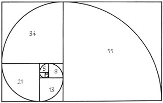
In mathematics the Fibonacci sequence is a seequence of the following integers:

1,1,2,3,5,8,13,21,34,55,89,144...

It can be represented visually this way:

This is the basis for the Golden Ratio, that can be used as a compositional guide to help balance compositions of images in an aesthetically pleasing manner:


It has been used for centuries by the likes of Da Vinci.


Below is a video by Ali Shirazi examining a contemporary use of the Golden Ratio in the film There Will be Blood.


Here are a selection of posters from baubauhaus that also make use of the golden ratio

A couple of many many MANY examples in architecture

Frank Millar's Dark Knight Returns
One I personally found in Watchmen, I also found occurrences in issues of Sandman and Promethea


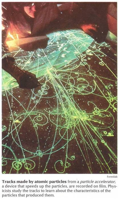
Rather more oddly the the Fibonacci sequence occurs regularly in nature:

Romanesque Brocolli (The most delicious Fibonacci Sequence?) 

Hurricanes

Spiral Galaxies

DNA


The psychologist Gustav Fechner  devised a test to see what role the golden ratio plays in human perception of beauty. While his results showed a preference for rectangle ratios centred on the golden ratio more recent attempts to test his hypothesis have been inconclusive at best.

The Golden Ratio is clearly an affective tool but its also a great mystery that seems intricately bound with the basic structure of the universe. And that just makes it cool.


Wednesday, 22 October 2014

Accessibility and Alphabets

At a talk posted on the Creative Bloq Derek Featherstone highlights how utilizing Accessibility in design can improve user experience across all users.


This got me to thinking about accessibility of typography and written communication in general. My first stop was Braille.


I found Greg Bland's Kobigraph designs beautiful in their execution. And may be one route I go down, there's plenty of information to design a new font based on the alphabet.

Looking into an abstract alphabet like Kobigraph made me think of other alphabets. The first that came to mind was morse code, another "language" that could be represented though audio and and tactile mediums. I decided to try the latter to trial it's effectiveness.

Making use of my girlfriend's pattern notcher I use it to cut a pattern along the border of pieces of card.

Notched Morse Code - The Alphabet

Notched Morse Code - The Alphabet (Close Up)

Notched Morse Code - Fine Tooth Comb

Notched Morse Code - Fine Tooth Comb
I really like the effect, despite a couple of "spelling" mistakes with the "Fine Tooth Comb", it seems like a successful experiment. I really like the tactile effect but I also feel it would be effective in a purely illustrative piece to add coherent and subliminal pattern to the piece.

International Sign Language also holds possibilities, both through still image or animation/film.


One divergent idea I thought of sprung out of one of my favourite quotes 

"Whoever saves one life saves the world entire"

Surely this is a form of idiom too? If only one far more densely layered than most that spontaneously emerge. Unfortunately I was unable to source a translator for what I would have like to have done as a design which would have involved highlighting the translation from the original hebrew text in the Talmund, This text heavy idea would later influence my final choices.


Colourful Idioms: The Final Four


This first peace is probably my favorite, once again I find myself drawing on the esoteric, this time using the alchemical symbol for the Philosopher's Stone, the legendary "Great Work" of the alchemists mistakenly said to be able to turn lead into gold. Many scholars now believe the great work was a spiritual process of achieving some level of personal enlightenment; a noble goal and perhaps more valued to some than gold.  The deciding factor was the origin of the phrase being Shakespeare's Merchant of Venice. Shakespeare himself is said to have encoded many alchemical secrets into his works. Make of that what you will but I thought it was a great play on words that would allow me to take the phrase in a relevant yet none literal direction. I decided to leave the grid visible to help guide the eye down the text.


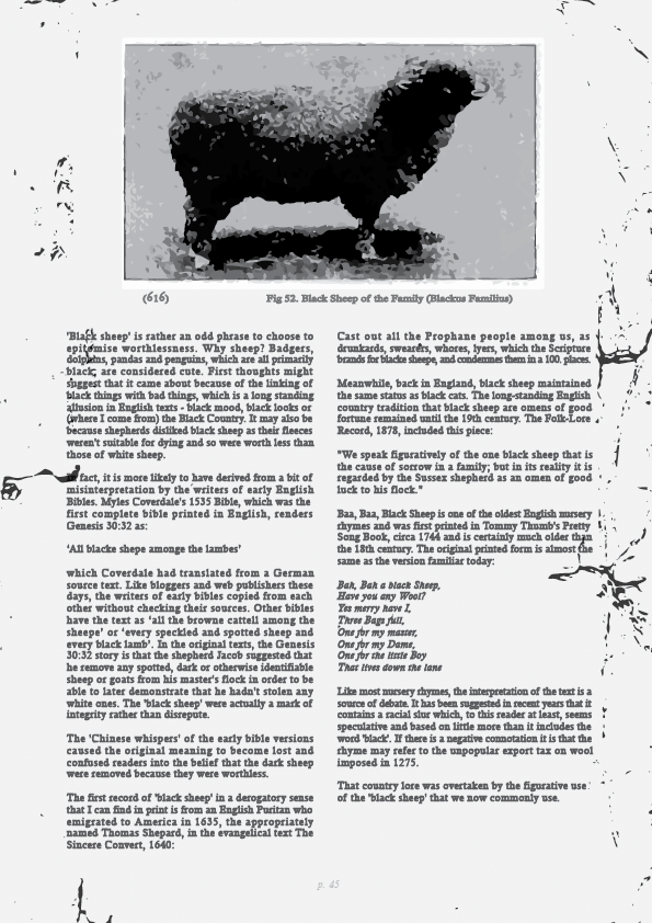
The black sheep of the Family is an oldie and a goody and for it I drew on my own family of experience, specifically my grandfathers old outdoors manuals from training his dogs and shooting as well as cartoon artwork they had a few signed pieces of around their house ever since I was little; the artist's name escapes me now but he was at least semi-local. I love old books and reading up on typography reminded me of how much I can appreciate the aesthetic of a good book.

[Grid reference; saved to different drive, will upload asap]


Blood in the Water was my first design and was much more a practical piece compared to the prior two as I had to reacquaint myself with photoshop and look up tutorials to make the blood effect:
I ended up following a "smoke effect" tutorial but tweaking it as I went out so it resembled liquid rather than smoke. I'm really happy with the effect, though it took ages of fiddling to get the Clipping Mask to take!  A few of the other details such as the measurements on the Ascenders were fiddly but straightforward additions that I think were needed to add something to the otherwise formulaic text - sans the blood effect.

The blue text was a later edition to tie it further into colour aspect of the brief with avoiding the blatant Red connotations I reference the blue of the water as it is tainted by the blood. The Origin text is clearer so it draws the eye from the main text and as the eye adjusts the background text becomes clearer.


I like this one, it was the first of the two using two large bodies of text (no pun intended but yes that is Homer Simpson's gut), I wanted a piece to highlight the potential beauty of a body of text, I carefully justified the text so as to avoid rivers and remove the rag. I used minimal colour and decided against using a title as I felt highlighting any occurrence of the word "Yellow-belly" in "Simpsons Yellow" would be far more effective and keep the body of text as the focus of the piece which meant I also needed to keep the image minimal. Here it is with the Grid visible: